An Amiga style demo remade with CSS3 and JavaScript
19 May 2016Some twenty five years ago the legendary Amiga demoscene group Melon Dezign was founded. Intros are small onescreen demos, most often having a logo, a scrolltext and a more or less advanced graphical demoeffect. A 3d rotating cube or maybe a plasma effect were popular elements in a intro from the ’90s.
Recently I thought it would be a fun little code project to make a web browser demo with these kind of features. Amiga demos are often coded in assembly, but these demoeffects would be doable with HTML, JavaScript and CSS, wouldn’t they?
Music used in these kind of demos were chiptunes, synthesized music created with music trackers. To summarize, I needed:
- Code: HTML, JavaScript and CSS
- Graphics: a logotype
- Graphics: a font
- Music
The idea was to do the code part myself, and let someone I know from the demoscene take care of the graphics and the music. As I happen to be a member of a 30 year old Commodore 64 demogroup, I have the pleasure to know some really talented guys (and girls for that part). I asked a group member to compose a song for me, hopefully with inspiration from the chiptune world. The logotype was drawn by another member.
And, as if bringing these geniuses together wasn’t enough, the demo would be even more complete with an original Melon Dezign artwork in it. So I reached out for Melon Dezign founder Seen (Henrik Lund Mikkelsen) and asked for the font used back in the days.
I decided upon making these demoeffects:
- An animated logotype.
- A 3d rotating cube. Maybe with some nifty effects on the cube sides itself?
- A plasma.
- Lines with endpoints moving along sine curves and maybe with some beautiful color washing.
- Text that is animated in some way, maybe slided up from the bottom and then faded away.
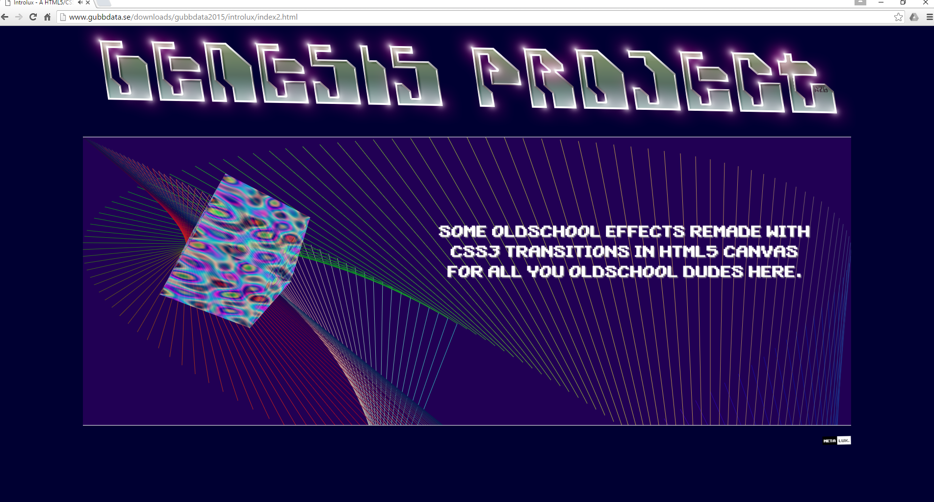
Animated logo
A horizontally waving logotype is a popular effect in C64 demos, traditionally called a tech-tech. These demos have a far more complex implementation that includes requirements to have stable raster synchronization. We don’t have to worry about such things here though. We’re going for a simple skew animation instead. With some @keyframes CSS rules and animations this is easy:
header img {
    -webkit-animation: skew 0.75s ease-in infinite;
}
@-webkit-keyframes skew {
    0%, 100% {
        transform: skewX(15deg) skewY(2deg);
    }
    50% {
        transform: skewX(-15deg) skewY(-2deg);
    }
}
Rotating cube
Three dimensional rotations for computer graphics is an interesting topic involving linear algebra and rotation matrices, albeit a bit out of scope for this project. Just understanding the algorithm isn’t a trivial thing, and then implementing it in assembly like in real demos then you’re in trouble. With CSS3 things are easier, to say the least.
<div class="cube animateInfinite">
    <figure class="front"></figure>
    <figure class="back"></figure>
    <figure class="right"></figure>
    <figure class="left"></figure>
    <figure class="topFoo"></figure>
    <figure class="bottom"></figure>
</div>
.cube {
height: 200px;
width: 200px;
opacity: 0.5;
-webkit-transform-style: preserve-3d;
-webkit-transition: transform 1s linear;
}
.cube figure {
position: absolute;
height: 200px;
width: 200px;
}
.animateInfinite {
-webkit-animation: rotate 2s infinite linear;
}
.front {
background: #D138BF;
-webkit-transform: rotateY( 0deg) translateZ( 100px);
}
.back {
background: #E7E247;
-webkit-transform: rotateX( 180deg) translateZ( 100px);
}
.right {
background: #5C80BC;
-webkit-transform: rotateY( 90deg) translateZ( 100px);
}
.left {
background: #E9EDDE;
-webkit-transform: rotateY( -90deg) translateZ( 100px);
}
.topFoo {
background: #8AAA79;
-webkit-transform: rotateX( 90deg) translateZ( 100px);
}
.bottom {
background: #473E3F;
-webkit-transform: rotateX( -90deg) translateZ( 100px);
}
@-webkit-keyframes rotate {
0% {
-webkit-transform: rotateX(0deg) rotateY(0deg);
}
100% {
-webkit-transform: rotateX(360deg) rotateY(360deg);
}
}And by throwing in some scale(0, 0) and scale(1,1) we can zoom in and out the whole cube as a transition effect as well.
Plasma effect
A plasma effect is an effect achieved by applying different sine and cosine functions to color values, giving the illusion of a colorful liquid movement. This is done in the demo by a JavaScript repeatedly updating the canvas with new pixel colors.
Putting the plasma on the cube sides would be a serious 8 bit effect. Here it’s a bit simpler.
Lines
canvas is an HTML element which can be used to draw graphics using JavaScript. By calling getContext() on the canvas you get a 2D rendering context object that you can draw within.
var canvas = document.getElementById("canvas"),
	contex = canvas.getContext("2d");
context.beginPath();
context.moveTo(x0, y0);
context.lineTo(x1, y1);
context.stroke();
Then just iterate those coordinates through a sine function of some sort, e.g.:
function (i) {
    return Math.floor(canvas.width / 2
                    + canvas.width / 2
                    * Math.sin(i * Math.PI / 64.0));
}
Animated text
Most demos have a text message. A basic effect is to implement a horizontal scrolling text, but for this Amiga style intro a slide in effect would be a better choice. And guess what, with CSS3 this is a piece of cake. The animation CSS property can have a comma separated list of keyframe values.
.text {
    -webkit-animation: slideUp 0.5s ease-in-out 0s 1 normal forwards running, fadeOut 1s ease-in-out 3s 1 normal forwards running;
}

@-webkit-keyframes slideUp {
    100% {
        -webkit-transform: translateY(-70%);
    }
}

@-webkit-keyframes fadeIn {
    0% {
        opacity: 0;
    }
    100% {
        opacity: 1;
    }
}

@-webkit-keyframes fadeOut {
    0% {
        opacity: 1;
    }
    100% {
        opacity: 0;
    }
}
Result
Putting it all together I got a quite decent demo, without any JavaScript libraries or any WebGL. I didn’t bother to make it cross-browser, it’s Chrome only.
And what would be more appropriate than to release it on a traditional old school demoparty? So this was being showed at Gubbdata 2015 in Lund, Sweden.